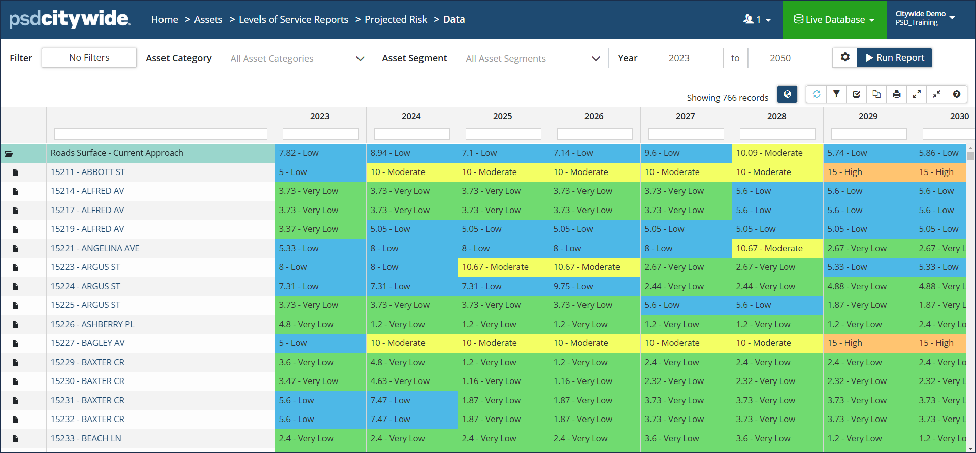
The Projected Risk report is a multi-year report showing how the risk rating of assets changes year after year. Lifecycle events are included in reporting by default to show how the currently applied strategies impact asset risk over time.
|
Report Type |
|
|
Data View: Classic colour-coded report showing how the risk rating of assets change year after year. Data can be grouped by Classification or by Profile. Click to check/uncheck Assume Replacement and/or Include Lifecycle Events. The Strategy Method defaults to Asset-end-of-life but can be changed. Click to view mapped assets in the GIS viewer. |
 |
|
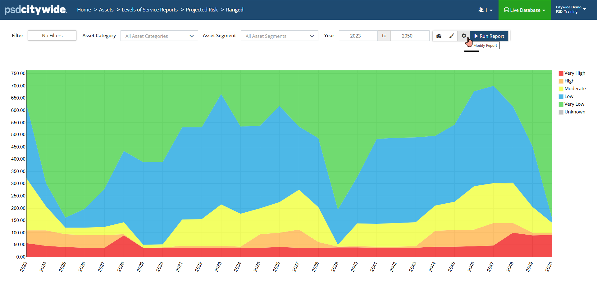
Bar/Ranged Area Chart: Colour-coded visualization showing high-and-low risk ratings of assets over a defined range of years (x axis). Y-axis can measure Asset Count, Cost or Quantity. Hover over a data point to see a summary for the year. Additional visualization options include Probability of Failure and Consequence of Failure. Click Modify Report settings to change reporting options. Click Display Options to add a Total or for additional formatting options. |
 |
|
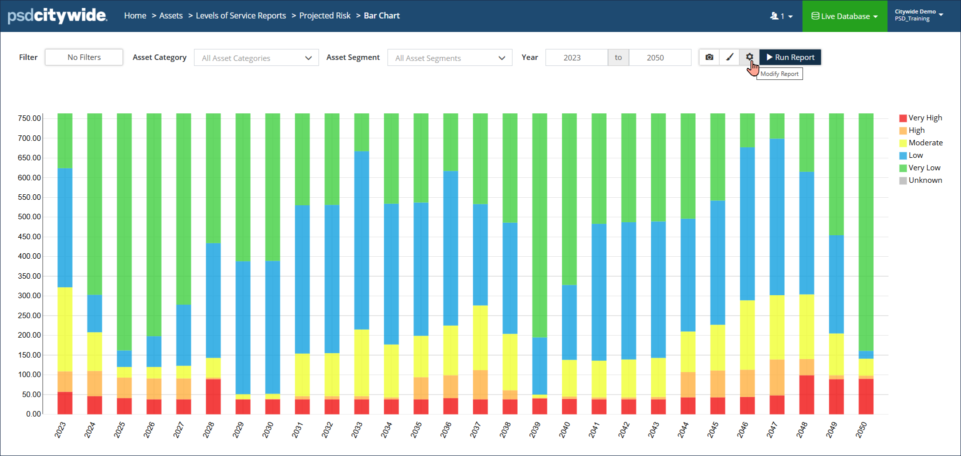
Bar Chart: Colour-coded visualization showing projected condition in stacked columns over a defined range of years (x-axis). Y-axis can measure Asset Count, Cost or Quantity. Hover over a data point to see a total for a condition level. Click Display Options settings to add a Total or for additional formatting options. Click Modify Report settings to change Measure or Costing options. |
 |