
A View (also called a Worksheet) is a grid thorough which users can view and edit data.
Multiple Views may be created for each Class, each with its own characteristics, such as data selection, formatting, column and row layouts, row subtotaling, column calculations etc.
Standard Views are provided, however the System Administrators may modify existing Views and add new custom Views.
The properties of a View are defined on the Details tab:
| Area | Item | Function |
|---|---|---|
|
Editing controls |
|
|
|
|
Display Line Items |
Allows line items to be displayed in the View. |
|
|
Allow updates at Line Item Level |
Allows or disallows user data updates at the Line Item or detailed level (individual line entries or transactions).
This works in conjunction with similar controls at the Class, Class Column and View column levels. For example, if updates at the line item level are disallowed at the Class level, this will apply to all Views within the Class, so this option would be automatically disabled at the View level.
|
|
|
Allow updates at Balance Level |
Allows or disallows user data updates at the Balance Level (a single summarized entry for the account).
As with the Line Item level controls described above, this works in conjunction with similar controls at the Class, Class Column and View column levels.
|
|
|
Allow deleting rows when columns are locked |
When a View includes locked columns and those columns contain data for a row, the default behavior is that the row cannot be deleted.
This option overrides the default behavior.
|
|
Selections |
Selection Type | Defines how data is selected and filtered for inclusion in a View. |
|
|
Key Segments (default) |
Selection by the COA Class Key Segment item. |
|
|
Related: Attributes |
Selection by an Attribute related to the COA Class Key Segment item. |
|
|
Tree Nodes |
Selection by Tree Node(s). |
|
Format |
Show gridlines (default blank) |
By default, cells in the View are outlined with a light gray grid (similar to Excel). Usually, for ease of data input and navigation, this option will be selected. |
|
|
Font |
This option is used to define the default font that will be used for the View. This font can be further customized at the individual row, column or cell levels. |
|
|
Style |
This option is used to define the default style that will be used for the View. This style can be further customized at the individual row, column or cell levels. |
|
|
Colours |
This option allows the selection of a background colour for the title column and read-only (non-editable) cells in the data columns of the View. These colours can be further customized at the individual row, column or cell levels. |
|
Widths |
|
These properties define the default column width for the Title column (first column in the View) and the data columns (all other columns in the view). These default settings can be overridden with custom properties in each individual column. |
|
|
Hide segment name in title column |
The title column of a View displays the list of Segment Items. This option determines if both the Segment Item ID and Segment description are to be displayed. For example, a Segment Item ID and description for an account might be "5100 - Salaries and Wages". If this option is selected only the Item ID number would be displayed. |
|
|
Title Column Width |
The default width of the title column. |
|
|
Data Column Width |
The default width of newly created data columns. This can be further overridden to vary the width for specific data columns. |
|
Notes |
|
Free form space for notes about the View. |
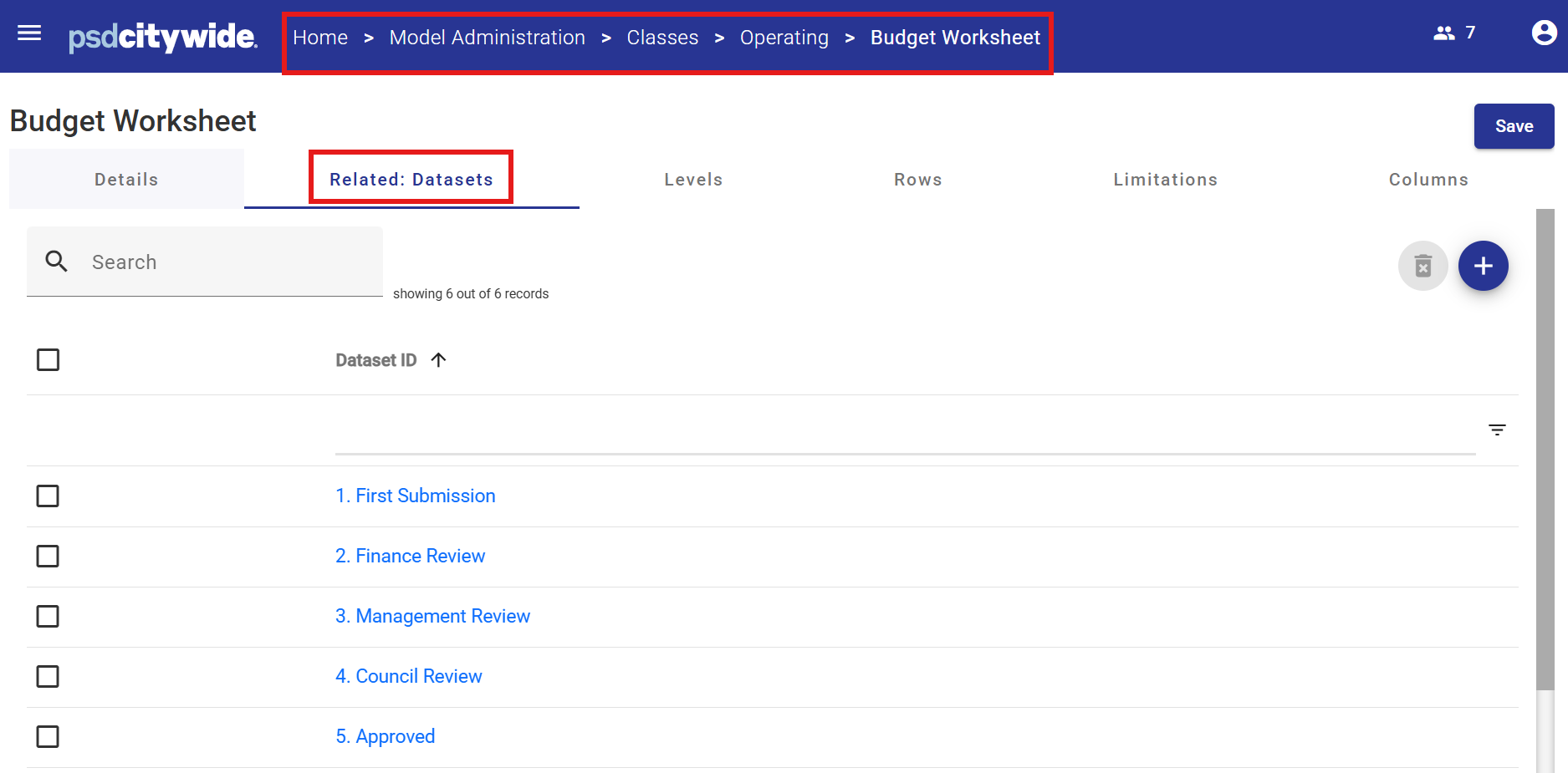
Related Datasets
Each View may be related to all Datasets or selected Datasets.
For example, a View defined to enter and edit Operating Budget data would be relevant to viewing Actuals data or entering Forecast data. In that case, the View would be related to the various budget Datasets (Department Submission, Approved, Amended etc.), but NOT related to the Actuals, Actuals Transactions or Forecast Datasets.
Note that since there is a relationship between Datasets and Classes, if a Class is not related to a Dataset, none of the Views defined within the Class will be related to the Dataset either.
The image below displays the Datasets that have been related to the "Budget Worksheet" View.
Levels
The Level determines which COA Class Key Segments from the Operating or Capital Class will appear in the View. As there is only one COA Class Key Segment defined for each Class, there is only one possible defined level in each View.
Rows
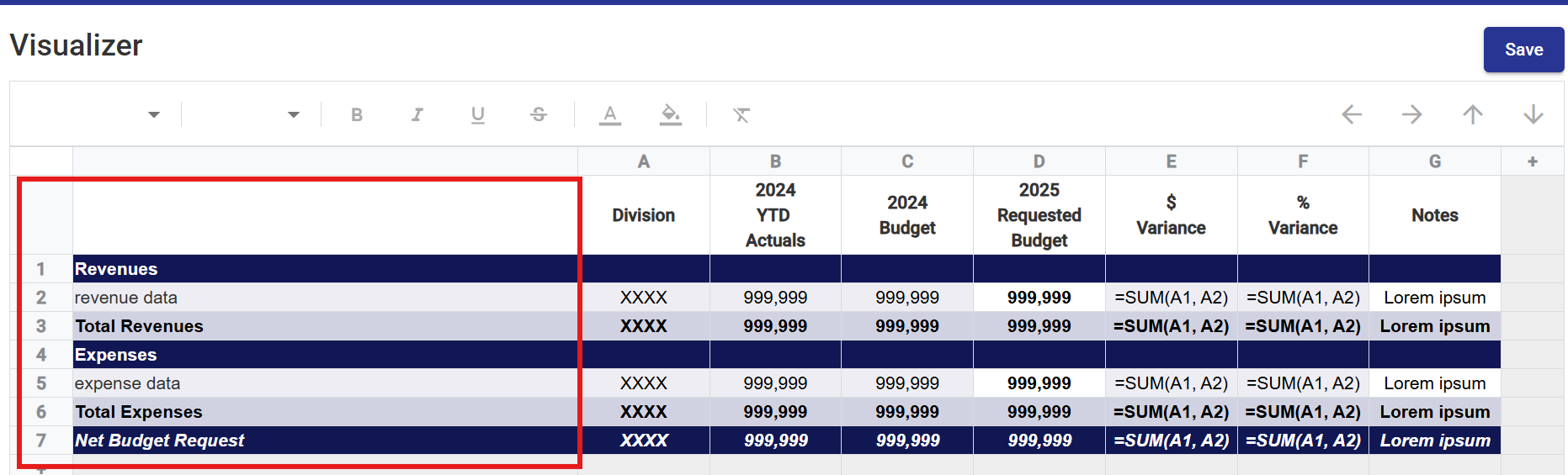
Rows determine how data will be grouped and displayed in the View.
Each Row is numbered and will have its own user-defined characteristics.
There are two types of Rows:
- Custom - Custom rows are non-data rows that may include blank rows, titles or calculations. They are used to customize the look and feel of a View and assist the user in navigating groups of data contained in the View.
A calculated Row contains a formula, which references other Rows in order to produce a result. Calculated rows are not updateable by users. Revenues, Expenses, Total Revenues, Total Expenses and Net Budget Request are custom rows in the example below. - Data - A data row contains data to be displayed to the user. The data source is defined by the Dataset and Year associated with the View. The content of Data rows can be filtered using Limitations applied against the COA Class Key Segment defined in the View. If no Limitations are defined, then all data will appear in the row.
In the example below, the row titled "revenue data" has a limitation applied to include only Items with a Natural Account Type of "Revenue". A wildcard limitation (such a 5*) is another type of limitation where, for example, all accounts beginning with the number "5" would be included in the row data displayed.
Rows can be added, modified and deleted by the System Administrator as required.
Row properties can be defined on the Row tab or via the Visualizer tool (available from the Details tab).
Row Properties
| Type | Custom |
Custom - Custom rows are non-data rows that may include blank rows, titles or calculations. Custom rows are not updateable by users. |
| Data | A data row contains data to be updated or viewed by the user. | |
| Name | The row label. For Custom rows, the name will be displayed as entered to the user. For Data rows, the name will not be displayed. Instead, the Item data defined in the Level will be displayed (i.e. a list of account items). |
|
| Title Font / Color / Style |
|
Controls the font and colours of the first column of the View, for the row. |
|
Data Cell Font / Color / Style |
|
Controls the font and colour for data cells for the row, in all columns to the right of the first column. |
|
Other Formatting |
|
Reverse displayed sign : Reverses the sign which would naturally be used to display numeric cells for the row. |
|
|
|
Underscore / Overscore : These options are available for Calculated rows only. Specify an overscore and / or underscore format on each cell. |
|
|
Decimals |
For numeric cells, the number of decimal places displayed is usually derived from the View column definition. To override the number of decimal places displayed for all numeric cells for the row, specify the number of decimal places to be displayed. |
| Symbol | Use currency / percentage symbol from column. In the case of numeric type cells the currency or percentage symbol displayed is usually derived from the View column definition. To change the currency or percentage symbol displayed on all numeric cells for this row, clear this checkbox and specify the currency symbol to be displayed. |
Calculation Rows
Calculation Rows allow users to define a formula.
CWBC uses row tokens e.g. r1, r2 to identify Rows in the formula.
Note that a single Row token refers to a single logical row - in the case of a Data Row, a single logical row will expand into multiple physical rows of individual Segment Items. These physical rows are summed in order to resolve the token.
The row numbers are displayed in the row table header to the left of each row. In the example above, the formulas are:
- Total Revenues: +r2
- Total Expenses: +r5
- Net Budget Request: +r2+r5
The following basic operators are available
- +
- -
- /
- *
- As many pairs of nested brackets (..) may be used as required.
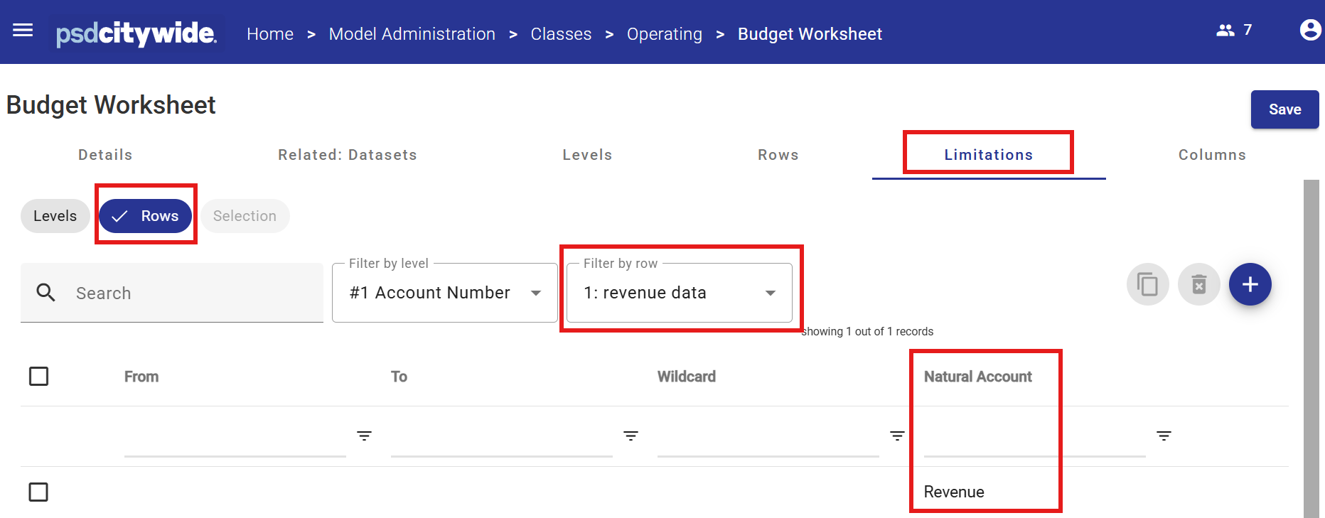
Limitations
The data that appears in a Row may be limited by defining a range or ranges to filter out unwanted data.
In the example above, the data row called "revenue data" will contain all Items with a Natural Account Type of "Revenue".
Columns may be defined using either a table and its related attribute panels within the Columns tab or via the Visualizer Tool (available from the Details tab).
When first creating a View, columns are automatically created for each Class Column defined in the Class by default. These can be deleted, modified or added to as required.
Column Properties
|
Formats / Display |
Column header labels |
Each column may have up to three labels which appear in the column header. The labels may also be edited directly in the column header itself.
A label may also contain a symbol embedded within the text in the form <symbol>. The symbol will be replaced with an appropriate value when the view is displayed.
Valid symbols are:
|
|
|
Currency / % symbol |
The currency (or %) symbol to be displayed against each numeric value in the column. Note that this can be overridden at the row level. If required, the symbol may be displayed on the first row within a group, only. |
|
|
Formats |
Use the property settings to define the text colour or the background colour of locked (non-editable) cells (for editable cells the background colour is always white unless overridden at the cell level). |
|
|
Decimals |
The default number of decimals to be displayed for a numeric column is usually derived from the class column. If the number of decimals to be displayed in the column differs from the default, click the Override defaults checkbox and use the spinner control to specify the number of decimals to be displayed for numeric data in the column. |
|
Controls |
Hide columns for balances |
If selected, the column will be hidden from the user at the Balance level. The column will still be available in the View for calculations. |
|
|
Hide columns for line-items |
If selected, the column will be hidden from the user at the Line Item level. The column will still be available in the View for calculations. |
|
|
Carry forward |
If selected, a number entered into a Line Item cell will update (increase or decrease) the associated balance in the Balance cell. In some cases, for example a rate, the Balance cell does not represent an increment of the underlying detailed items, so this option would not be selected. In the case of calculated columns (formulas) this flag means that the Balance cell will always be the sum of the underlying Line Item cells. |
|
|
Rollup |
This options determines whether an automatic sub-total is generated for column cells, and also whether, when the View is in a collapsed state, the underlying cells are updated and the total displayed. In some cases, for example a cell representing a rate, it does not make sense to sub-total or rollup. |
|
|
Balance |
Determines whether cells at the balance level for this column can be updated. This works in conjunction with a similar control on the associated Class Column and also the Allow Updates at Balance Level view control which applies to all columns in the View.
|
|
|
Line item updateable |
Same as Balance updatable settings, except it applies to the line item level data entry. |
Column Properties for Each Column Type
The five column types include: Class Column, calculated, comparative, Tree relationship and Segment relationship.
- Class Column: A column which references a Class Column, and is usually updateable by the user. The type of data that can be entered into the resulting View column depends on the type of the Class Column selected, i.e. numeric, text, date etc.
- Calculated : A column which contains a formula, which references other columns in order to produce a result. Calculated columns are non-updateable.
As with Rows, formulas will contain column tokens e.g. c1, c2, cx to identify View columns in the formula. The column numbers are displayed in the table header above each column. A simple example would be c1+c2, which for each row will add the value of the cell in column 1 and column 2. The following basic operators are available +,-,/,*. As many pair of nested brackets (..) can be used as required. - Comparative : A comparative column references data from another version / year (other than the primary version / year selected in the view). These columns are for information purposes and are always non-editable. The data is always from the same class as the primary view class.
Source Column
Specifies the Class Columns from the comparative Dataset/ Year set that will be aggregated and displayed in the comparative column.
Full year
Will aggregate all Class Columns that have the “Include in YTD” attribute set
Year-to-date
Will aggregate all Class Columns that have the “Include in YTD” attribute set and is equal to or prior to the current period set in System Administration.
For an explanation of how the current period can be set for each class, see Model Administration - Tasks.
Specific period / column
Will display data from a single specific Class Column.
Period / column rollup
Class Columns may be “rolled up” through a tree. Usually the Tree represents some kind of calendar (e.g. Quarters, Semi-Annual etc.). The Class Columns which roll into the selected node are aggregated.
Source Dataset/ year
Defines the source of the data, which is always the same Class as the data selected in the View, but usually a different Dataset/ Year.
Dataset
If the data in the comparative column is to be sourced from the same Dataset selected for the View, check the “Selected Dataset” option. Otherwise select the source Dataset in the dialogue box.
Year
If the data in the comparative column is to be sourced from the same year as the selected year, or relative to the selected year, of the View, check the “Selected year” option. Otherwise select the source year in the dilogue box.
A specific year offset may be specified. For example if the data for the year prior to the selected year is to be displayed, check the “Selected Year” option and set the offset to -1.
- Tree Relationship : A Node of a Tree may be displayed in a column, based on a rollup relationship to the key segments in the view data. For example, if there is an Organization tree, which rolls up Account Number COA Class Key Segment Items into Sections, Divisions etc., the designer might choose to display the Division in a Tree relationship column. The Division displayed in each row within the column will depend on the related segment item for that row.
- Segment relationship : A Key Segment Item related to the COA Class Key Segment Items may be displayed in a column. For example the Account Number COA Class Key for the Operating Class is related to the Key Segment called Fund. Against each row of data in the View, the relationship column will display the Fund related to the account shown in the View.